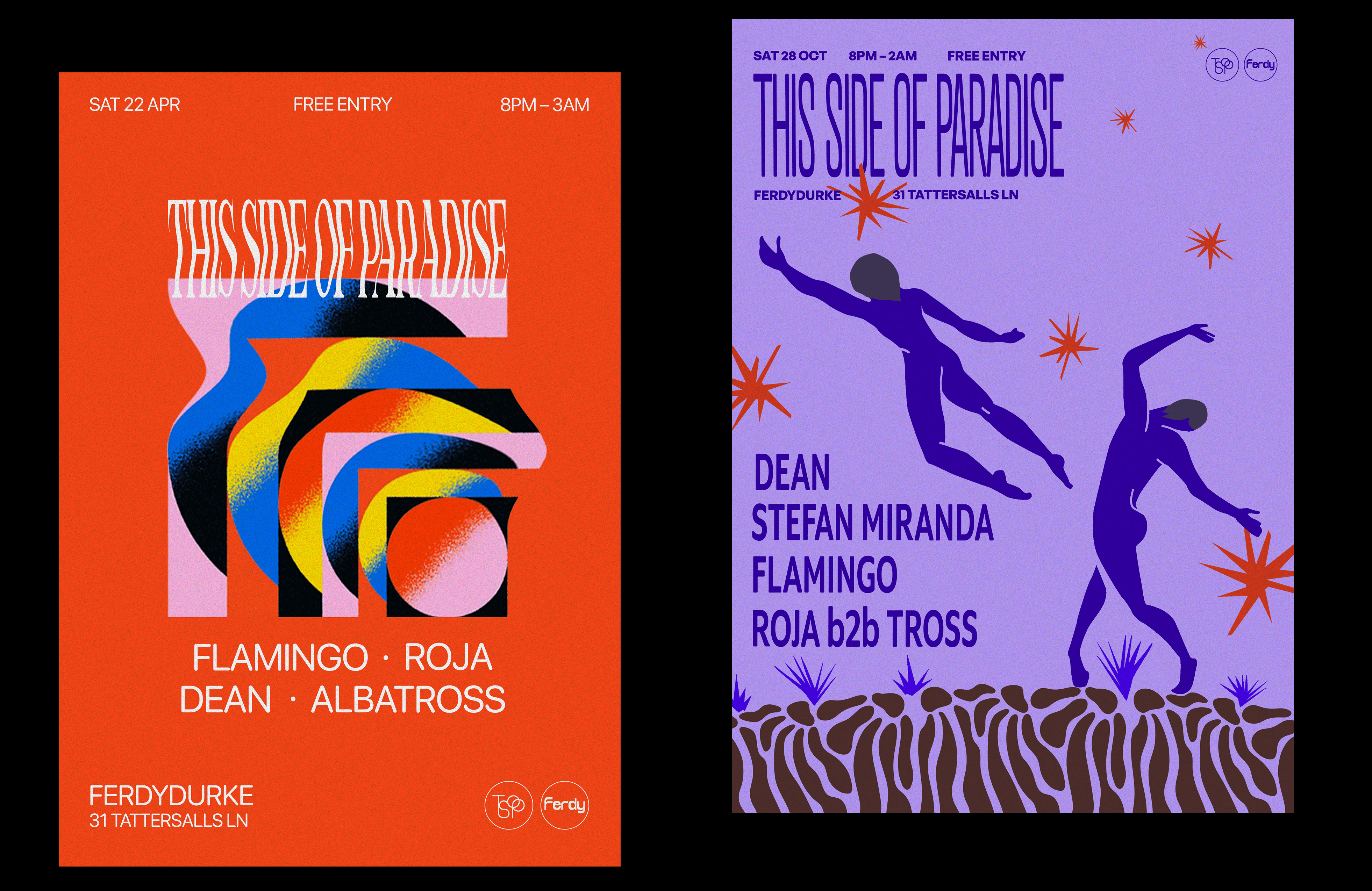
This Side of Paradise (TSOP) is a DJ collective, regularly hosting melodic techno and house events across Melbourne and internationally. I set out to create branding and promotional posters that echoed their sound: warm, unhurried, and made for a good time.
Client
This Side of Paradise
Services
BRANDING, DIGITAL DESIGN
Year
2024
(01)
Branding
As the name suggests, TSOP is about good music, sunshine, and the feeling of paradise. They wanted a simple line logo to carry that stripped-back spirit, something that matched the mood they curate rather than competing with it. The brief arrived exactly how the best ones often do: as a rough sketch on a napkin, shown in A1 and A2 below.
I took that idea and ran with it, developing a range of variations that stayed true to the theme. TSOP gravitated to C3. It is clean and pared back, yet the letters TSOP still read clearly at a glance.
With the direction chosen, I built out versions on both black and white backgrounds. The logo needed to stay simple and restrained so the promotional material could be where the colour and energy lived.


(02)
Promotional material
The posters gave the brand room to play. With the logo grounding a consistent base, the promotional pieces could lean bold and colourful, setting the tone for each event while keeping TSOP instantly recognisable across the series.