
A self-initiated redesign project of the Suunto app on iOS aimed to simply the overall experience and address some common pain points from personal experience and online forums.
Client
Suunto
Services
IA, app redesign
Platform
Mobile app
Year
2026
(01)
Why Suunto?
I have worn a Suunto since 2023. The watch is excellent: the battery lasts a long day in the hills, the offline navigation works, and the hardware handles weather. The app is the weak link, and going by the reviews I am not the only one who thinks so.
Most of my career has been on the web, I wanted a real world mobile problem to challenge myself with. So I set one: redesign the app I use every morning, with the same rigour I'd bring to client work.
Secondary goal: Update the UI so it aligns more with iOS 26 design patterns.
(02)
Auditing what exists
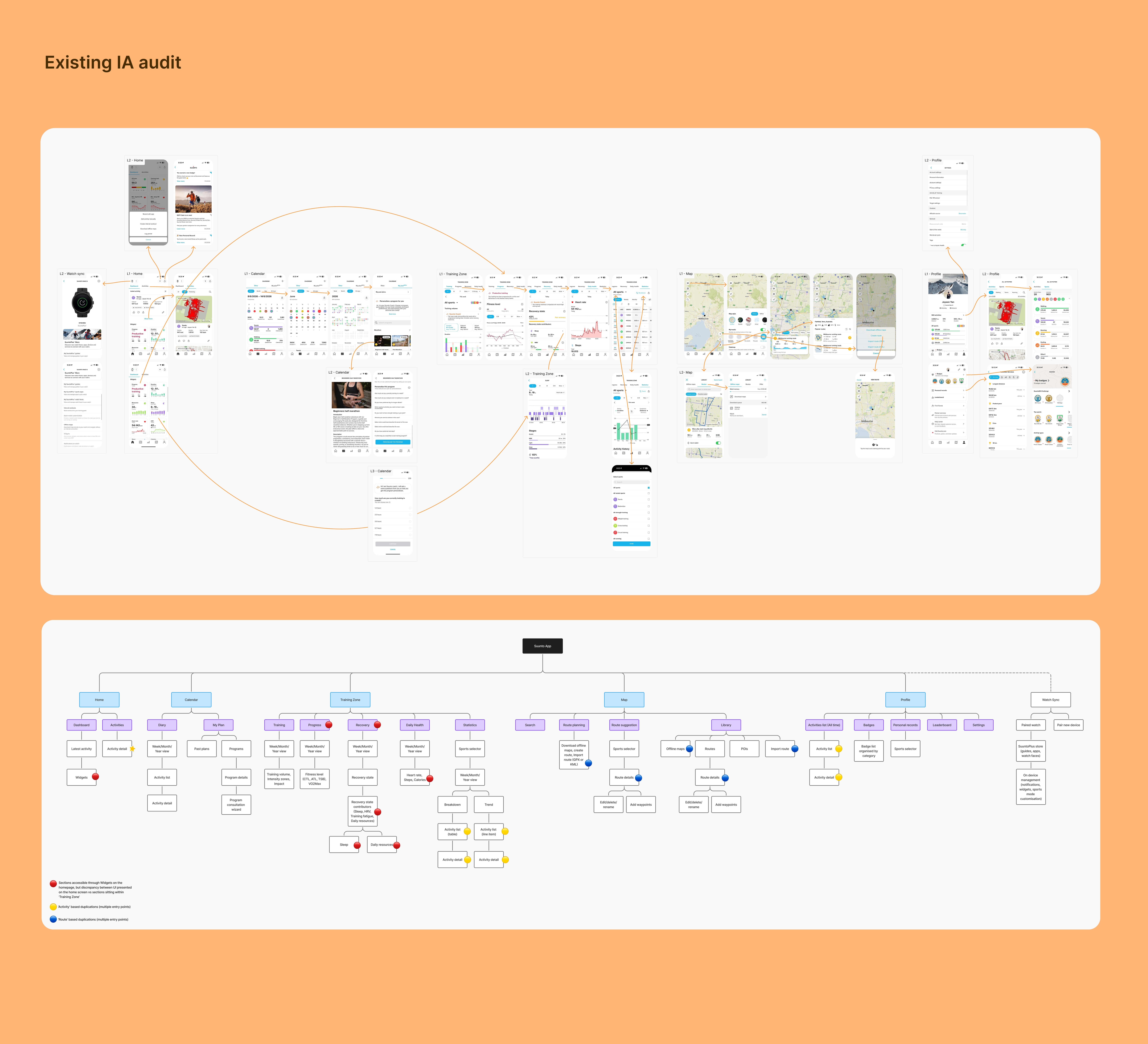
I screenshotted every screen in the app and rebuilt its sitemap node by node, then tagged every place the same feature appeared more than once. That produced thirteen flags, which clustered into three patterns.
Your activity history lives in five places, including one screen (Statistics) that renders the same list two different ways.
Route tools are duplicated across three containers in the Map tab, each with its own UI.
The homescreen widgets, the feature I'd have called the app's best, turn out to be shallow copies: tapping one opens a stripped-down version of a page that exists in full inside Training Zone.
Underneath all three is the same cause. The app never decided where anything lives, so each section built its own version.
One thing the audit changed my mind about: the top-level dashboard is good, and the reviews back that up. The app falls over one level down, not at the surface.
(03)
The problem
Before designing anything I checked my read against real users: Suunto subreddit, app-store reviews, and the long-form reviewers (the likes of DCRainmaker, the5krunner, T3).
The audit and the reviews agreed. People like the glanceable dashboard, the depth of the training data, and the maps. The same people call the metrics "opaque" and "text-heavy", describe the navigation as one of the most difficult to fathom among all brands, and point out that training load is tucked inside a widget that resets every Monday.
The loudest complaints online were a lack of dark dark mode and sync reliability. One of them was within my control, and the other wasn't, so I took dark mode into consideration whilst the sync reliability was deemed out of scope for this project.
That left something I could design against:
Suunto gives runners pro-grade training data and a clean surface to glance at. But the moment they dig for the insight that justifies the watch, the navigation turns labyrinthine and the metrics turn opaque.
Three How Might We questions carried it forward:
HMW surface the best insights at the moment they're useful.
HMW give every object in the app exactly one home.
HMW make the app explain itself in plain language.
(04)
Who this is for
I built two provisional personas from the audit and the published research. I have not interviewed anyone yet, and I would rather say that than dress assumptions up as findings. Every frustration on these cards traces back to a source.
Maya is Suunto's core customer, a trail and ultra runner who trains by the numbers and picked the brand for battery and navigation. She works around the app's structure because the data underneath is worth the effort.
Tom is two years into running and moving from casual to structured, and he reckons he is using about 20% of what he paid for.

(05)
The two journeys that mattered
I walked both personas through the task they open the app to do. Maya wants to know whether to do tomorrow's hard session, which is a two minute check of recovery against load. Tom wants to know how his run went and what the metric he is looking at actually means.
Mapping those two journeys changed the shape of the project. Maya's problem is information architecture and nothing else. Tom's is not. No amount of rearranging screens will explain Training Impact to someone who has never heard of it, so his fix had to be content design. Working out which discipline each problem belonged to stopped me trying to solve both with a sitemap.

(06)
A simpler structure
I explored three directions: keep the five familiar tabs and impose discipline on them, merge down to four, or restructure around objects. A weighted matrix put the last two close enough to be a tie, so my own priority decided it. The fewer top-level destinations there are, the less a customer has to think about where anything lives.
The result is four tabs. Today, Train, Map and Me. Everything to do with training, which covers activities, plans, progress, recovery and health, sits in Train.
Competitor analysis from Strava supported the merge and also supplied the warning. Their 'You' tab pulls activities, stats and profile into one place, which is the same move. The backlash to that redesign was about burying features, which is what happens when you merge tabs without fixing what sits inside them. So the structure carries one rule I had to focus on. Train's five sections sit as segments across the top of the tab, and nothing is ever more than one level from detail.

(07)
Wireframes solving key problems

Activities becomes the only activity list in the app
Diary and Statistics fold in as views of it rather than places of their own
Today's tiles preview data and deep-link to the source, so no metric ever has two UIs again
The Map's three overlapping route containers collapse into one model with a single detail screen, whichever way you choose to arrive from.
For Tom, every advanced metric gets an explainer sheet built to a fixed anatomy: the verdict first, then where it sits on a scale, then what it means in plain words, then what to do next. Structure sorts out where things live. That sheet is what makes them understood.
(08)
High-fidelity in action
The hi-fi screens test whether the structure holds up against a premium visual language: dark UI, a single orange accent doing the brand's work, real map data.
Today opens with the readiness ring and a coaching card, which answers Maya's question before she has to go looking. The Training Impact sheet is the explainer pattern built properly. Maps gets the heatmap treatment, which is the part of the app closest to what the hardware is for.


(09)
Outcome, measured honestly
This is a concept, so I measured the structure rather than claiming numbers I have not earned.
The entry points to your activity history go from five to one. Getting from opening the app to yesterday's run goes from five taps to two, or one from the Home tile. The number of activity list interfaces to learn goes from three to one. The Week/Month/Year selector, which the current app rebuilds six times, exists once in the design system that came out of this, and the sports selector went from three builds to one.
(10)
What I took away
The audit only became useful once I stopped counting problems and started grouping them. Thirteen symptoms turned out to be three causes, and three causes are something you can design against.
The bigger lesson came from Tom. I started this thinking it was an information architecture project, and the most valuable fix turned out to be content design. Being upfront about the gaps, the personas I have not validated, the sync problems I deliberately left alone, and the competitor mistake I used as a guardrail, made the work more credible rather than less.