
A year-long project to bring order to AGL's residential website as it grew into a multi-product provider. I led it end to end, rebuilding the navigation system, delivering 16 page templates, and defining 20+ governed AEM components that saved around $1.1M across design and development.
Client
AGL ENERGY
Services
IA, research, website redesign
Platform
Desktop/Mobile web
Year
2024-25
(01)
The problem
As AGL transitioned from an Energy retailer to a multi-product service provider including Internet, Mobile, Solar and EV products, there is a need to address how these different products sit across the Residential website.
Net Promoter Score (NPS) feedback and customer interviews pointed to a consistent set of pain points: navigation that did not support a multi-product offering, products and services that were hard to tell apart and understand, a growing gap between the digital experience and AGL's brand marketing, a homepage that buried promotional offers, and a broader lack of trust in AGL as a provider of more than electricity.

(02)
How the project actually unfolded
This was not one neat project. It was several that flowed into one another and grew in scope as we went. What started as a focused piece on information architecture and navigation extended into a component uplift, and eventually became a full residential website redesign.
Rather than walking through every artefact, I want to focus on the decisions that shaped the outcome, the constraints I had to work within, and where the real problem-solving happened.

(03)
Setting the foundation
I joined just as the UX researcher was wrapping up the new high-level IA. My first job was to make it real. I took that structure and built a detailed site map covering every page the new IA would include.
That surfaced the first challenge quickly. Many pages had unclear relationships, and no single person held the full picture. To resolve this, I worked with the EV, electrification, and solar and battery teams to pin down where each page belonged and how they connected. It was slow, unglamorous work, but without a solid foundation underneath, nothing above it would hold.
With the IA locked, I turned to navigation across every level of the site: the homepage (L1), the category pages (L2), and the child pages beneath them (L3 to L5). I worked through the global navigation, the homepage nav hub, cross-category navigation on the L2 pages, and on-page navigation deeper in. After several rounds of testing and stakeholder reviews, the navigation system was signed off.

(04)
Navigation and politics
Navigation proved to be as much a stakeholder challenge as a design one.
The global navigation was contested from the start, with each part of the business wanting their product represented in it. The business had also ruled out a mega menu or dropdown, which meant the global nav had to stay lean, essentially category-level links, while still doing justice to a growing product range. Holding that line took careful negotiation alongside the design work.
The homepage nav hub was the other key decision point. Rather than debating treatments in isolation, I advocated for A/B and user testing to let the evidence guide us. We tested tabs, tiles, and simple links, and links performed most effectively. From there the question became how many links to surface per category. Three tested poorly and created clutter and increased cognitive load, whilst two proved to be the right number for getting customers to the pages that mattered most, quickly.
On the category pages, the central issue was inconsistency. The old category navigation shared the same visual treatment as quick links and anchor links, so customers could not easily tell them apart. That ambiguity was a direct contributor to the navigation issues we kept seeing in the research.


(05)
Building a component system
Underneath the navigation problem sat a deeper one. There was no real component system. When content producers needed something, they built a bespoke artefact to fit that moment. Over time this left the site covered in near-duplicates: multiple card styles, multiple link styles, small variations everywhere that added up to a fragmented experience and customer's trust in the AGL brand suffered.
I worked closely with the AEM and Design System teams to replace that with a governed set of components, each with clear rules for when and how it should be used. I started with an audit, mapping where every major component appeared across the site and cataloguing the variants where things had drifted. From there I could see which cases genuinely needed variation and which were just accidental sprawl, and I shaped the UI, motion, and interaction patterns for each one.
The payoff was twofold. The experience became consistent for customers, and publishing became far faster for content producers, who could now assemble and ship pages from a trusted kit instead of reinventing pieces each time.

(06)
Aligning brand and digital
The hardest constraint was not technical. Brand and digital had a strained history, and Brand and Marketing had traditionally held significant sway over how the website looked and behaved. That left real tension to work through.
I approached it as a relationship to rebuild rather than a battle to win. I set up regular catch-ups with the Brand and Marketing teams, shared our digital vision openly, and worked to understand their guidelines from the inside. Both sides gave ground, and we landed on a shared UI direction everyone could stand behind. Part of the job was knowing when to push back for the customer experience and when to let something go, and getting that balance right is what kept the partnership intact.
I also contributed to the illustration work, helping steer the illustration style in a clear direction while staying true to the brand guidelines.


(07)
Outcome
By the close of the project I had delivered future-state templates for 16 key pages across the AGL residential site, more than 20 new AEM components with governance on where and when to use them, an uplifted navigation system spanning the homepage, category pages, and deeper child pages, and a visual direction for AGL's digital space.
The business impact was significant. Component adoption drove around $475,000 in design cost savings across 7 designers, and roughly $660,000 in development cost savings across 9 digital scrum teams.


(08)
Process changes
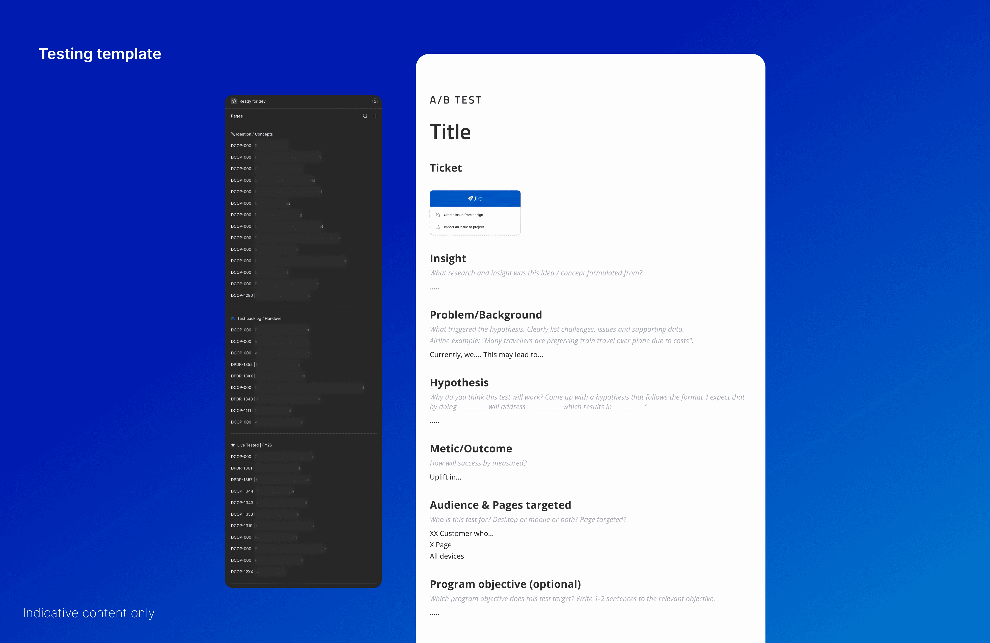
Beyond the designs themselves, one of the more lasting outcomes was a change to how the teams worked. There was no central place where designers, the optimisation team, and the wider product team could see which A/B tests were live, what was coming up, and what sat in the backlog. That visibility lived only with the optimisation team, tucked away on a Confluence page.
To close that gap, I created a testing template in Figma that documented each test in one shared, accessible place. It captured the details that matter when you are reading or building on a test: the insight behind it, the problem, the hypothesis, the metrics, and the audiences being targeted.
The template has outlived the project. It has become something of a testing 'bible' for the teams and is still in regular use today, which is the outcome I am most quietly proud of.
(09)
What I took away
This was the largest and most tangled project I have led, and it stretched me well beyond craft. I learned how to hold a design vision steady while navigating competing stakeholder interests, how to use testing to take heat out of subjective debates, and how much of senior design work is really relationship and project management. Most of all, it reinforced something I now carry into every project: a strong system, whether it is an IA, a navigation model, or a component library, is what lets good design scale and hold up long after you have moved on.