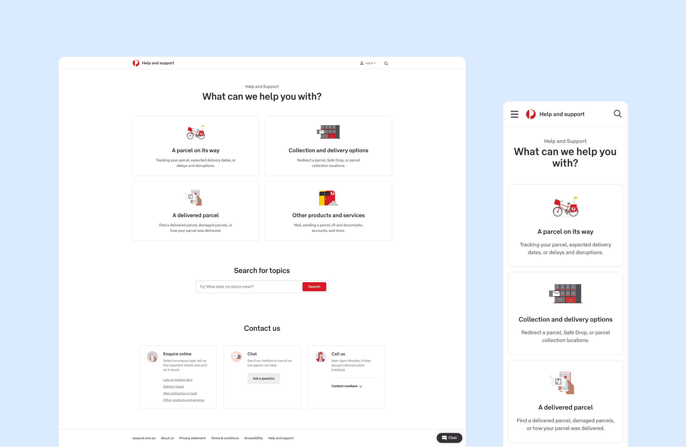
Help & Support Reimagined aims to streamline AP's support portal by simplifying user entry points and to provide more in-depth solutions so users can receive the assistance they need quickly.
Client
Australia Post
Services
Product design, research
Platform
Desktop/Mobile web
Year
2023
(01)
Customer pain point
The previous Help & Support portal at Australia Post had a landing page with 10 tiles covering various topics, serving as entry points for support. However, user engagement with these tiles decreased, leading to a rise in contact center calls for help and support. After investigating and conducting user interviews, we discovered that one of the main reasons for this was the lack of clarity in these entry points.
For instance, users often faced confusion when dealing with parcels marked as delivered but not received. In such cases, there were multiple tiles that could apply, such as Tracking, Delivery Issues, or Delivery Options. Even if users eventually found the relevant FAQ category after navigating between the tiles, the arrangement of the FAQ items was counter-intuitive, with popular questions buried deep in the page. In addition, users felt these answers were lacking in detail and sometimes failed to resolve their issues.
Consequently, users tended to abandon the self-service option and resort to calling the contact center. This created frustration and unpredictability, as customers didn't know how long they would have to wait for a response. Additionally, this led to a significant increase in the workload for the call center, resulting in higher costs for the business, despite the fact that the issue could have been easily resolved online.

(02)
Approach
We first conducted a competitor analysis on help and support portals from various industries ranging from postal to tech to education. There were a wide range of approaches to an efficient support experience, but the thing they all had in common was the ability to get users to the solution they needed with minimal ambiguity, this included more general categories the would funnel into something more specific.
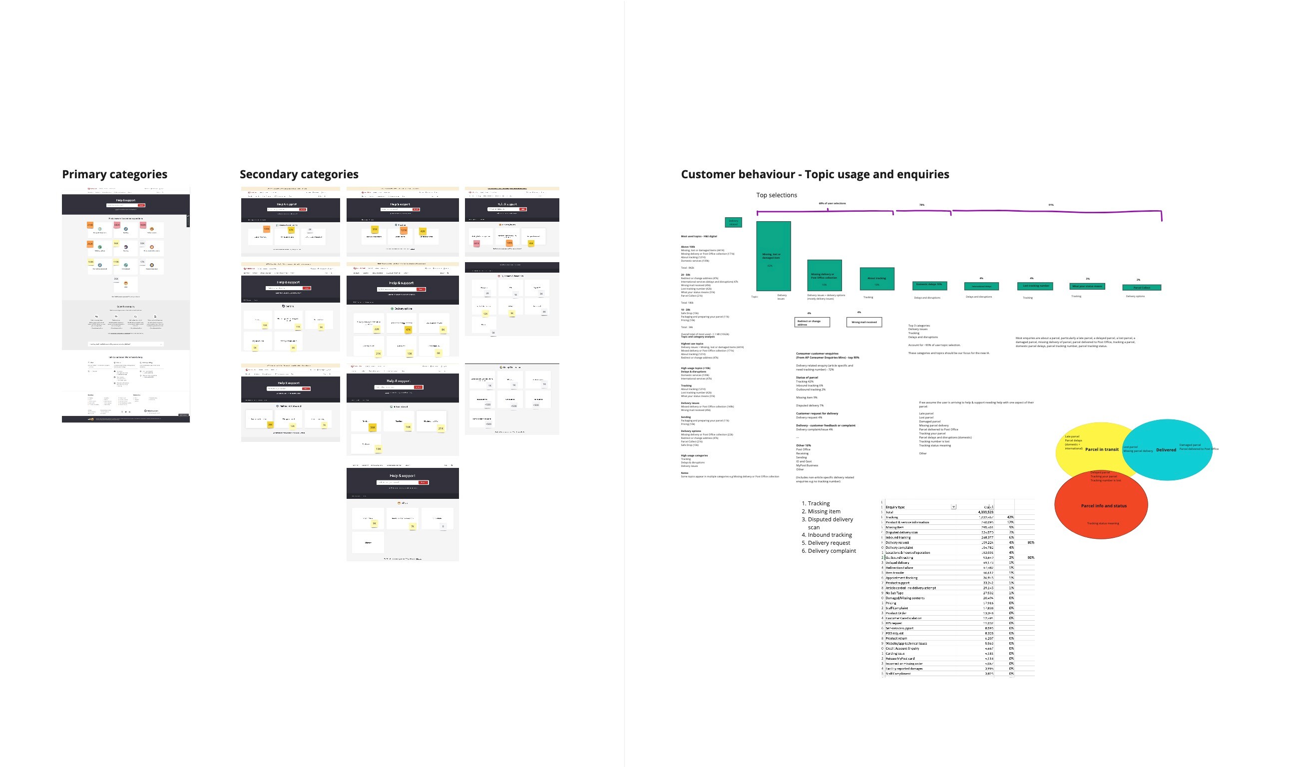
To simplify our entry points, we know we needed to decrease the number of tiles users are faced with at the start. From analytics, we know our customer enquiries are split into 2 buckets with 90% being delivery related and 10% being other. Of the delivery related enquiries, 72% were article specific (meaning they have a tracking number). Having a tracking number would greatly increase the chances of their issue being resolved by self service online. We also looked at the most visited categories in a given year to determine our most popular questions that we should surface first.
(03)
Content Validation
After thorough analysis of the data, we implemented several rounds of tree jack testing to see whether the category groupings made sense and whether it was helpful. We initially had 3 different tree options with each one focusing on a different customer mindset:
Clear categories, more branches
Problem focused
Parcel journey with emphasis on customer language
The results from the first round of testing were positive. Any tree with an overall rating of 65+ is considered to be a good score (as we're only testing the IA without the help of visual aids and hover-texts etc). Overall, Tree 3 objectively performed the best with an average score of 66 with 8 of out 13 tasks "passed" - indicating an effective tree with only minor revisions needed.
The majority of the "failed" tasks in tree 3 were also a problem in the other trees, meaning we had to further address these problems so they don't trip up our users in the experience.
After another round of tree jack testing and customer interviews, we were able to settle on a tree with 4 main categories that drill deeper in level 2 and 3 sub-categories.
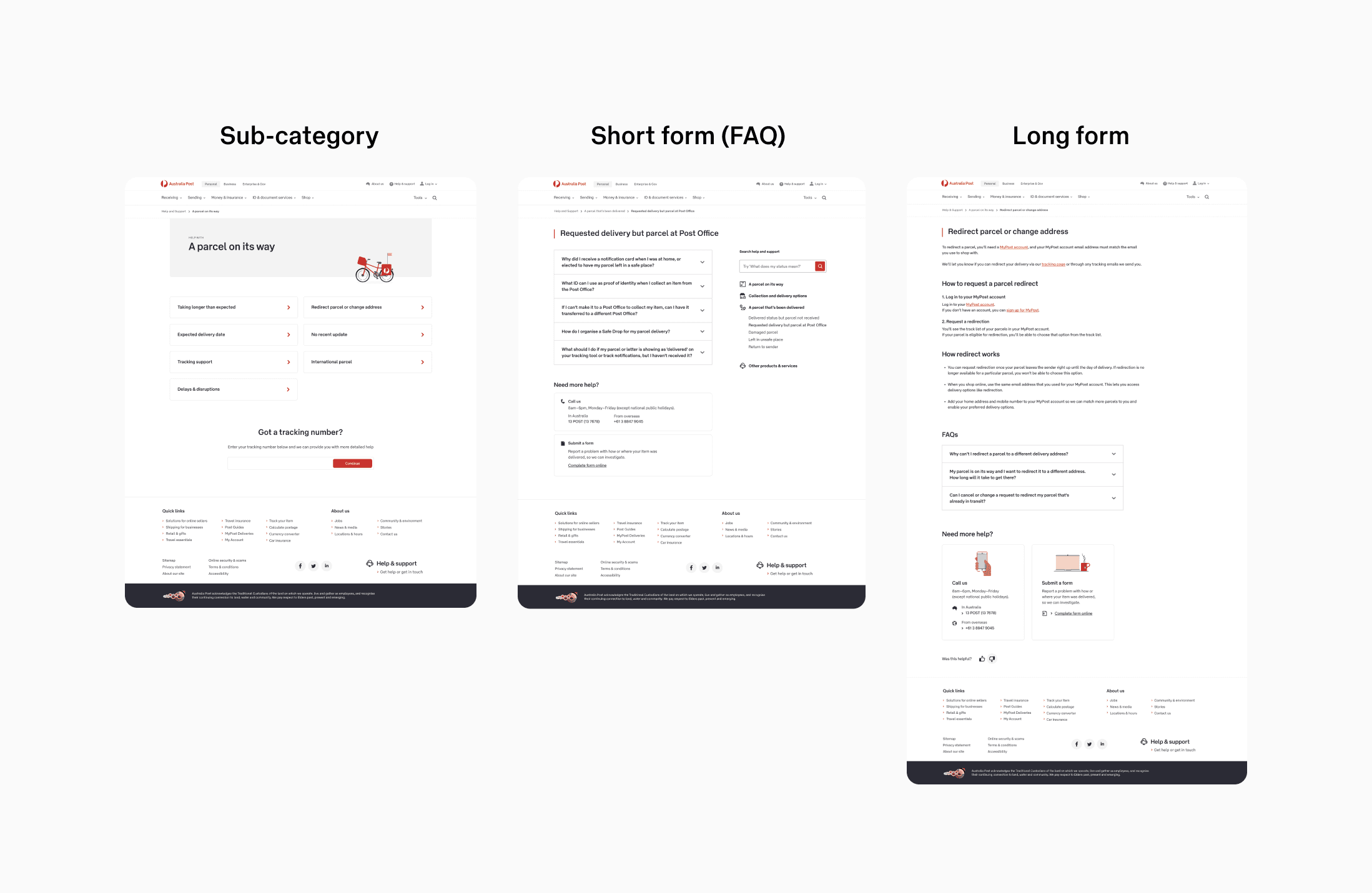
Through the customer interviews, we also saw a need of long form content that provided more in depth information for tasks that involved several steps that we could guide users through with the help of pictures and screenshots.


(04)
Design & validation - Round 1
Now that we have determined the IA for the support portal, it's time to bring the content to life through designs.
I started with a simple wireframe that mapped out the entire user journey - from the landing page, to the 2nd and 3rd level category pages, and finally the short form FAQ and long form article content pages.
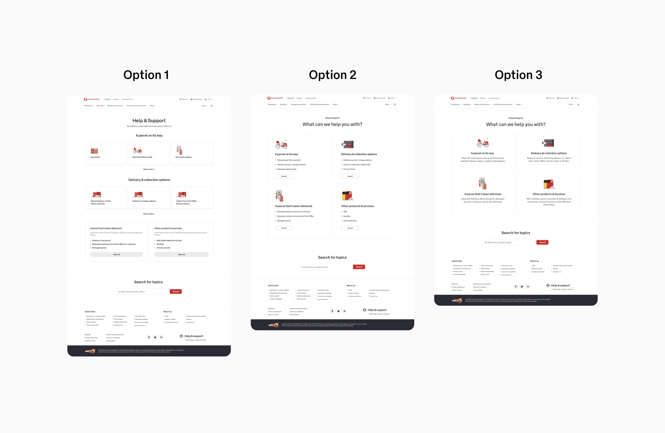
One of the first challenges I faced was around content hierarchy. Since we are now introducing another level of sub-category, some topics gets nested deeper down the journey, resulting in more clicks for users and a potential for users to get lost in the process. I came up with a few iterations:
1. Showcasing the 2nd level sub-categories for our 2 most popular categories
2. Direct links to FAQ pages grouped into each category. This is quite a common pattern in support portals as found through competitor analysis
3. A simpler design where we just show all the categories in clickable tiles. However, I felt as though this option might not provide adequate context upfront, like what content is actually in 'A parcel on its way'? So we added a short 1 sentence sub-text that gave users a bit of information on what to expect.
Through some quick guerrilla tests we decided to go with designs 2 and 3. The next step is to flesh out these designs and prototype them for user testing.
(05)
Design & validation - Round 2
We ran the users through 6 different tasks and also tested the 2 different landing pages.
Users were able to pass these tasks rather intuitively and the simpler option 3 landing page came out on top.
Although option 2 could provide a quicker way to some popular questions, it meant the page was longer and there were more information displayed on the page. This in turn means a much higher cognitive load, and we saw that users actually spent longer on that initially landing page as they had to read through the various links displayed.
When going through option 3, users were quickly able to select a category and start to funnel down the flow. We had a positive feedback on the short sub-text that provided context and decreased path ambiguity.
A great piece of insight that came out of testing was around the header and footer. We used our standard AP header and footer that had a large amount of information that wasn't really relevant to the help and support experience. Quite a few users got confused around the 'Help & support' links that were present in the header and footer, and thought that it would take them somewhere else even though they were already in the portal.
This was great feedback, so I iterated the designs with a bespoke header and footer.
We also received positive feedback about the long form articles and further validated a need for this type of content in our support portal.

(06)
Outcome
With further iterations and validated changes, I was able to create an experience that was truely helpful to users whilst achieving the requirements of simplifying the entry points, encouraging more intuitive self service and provide a pathway to more in-depth answers.
The development of the project is sliced and taken into a phased approach. The first and second phases consisted to simplifying the tiles on the landing page, the sub-category pages, uplift of the FAQ pages and introduction of long form content.
We have just completed phase 3, which is uplifting the header and footer and contact channels on the landing page.
You can see the live experience here.
Phase 4 will include improved search capabilities.